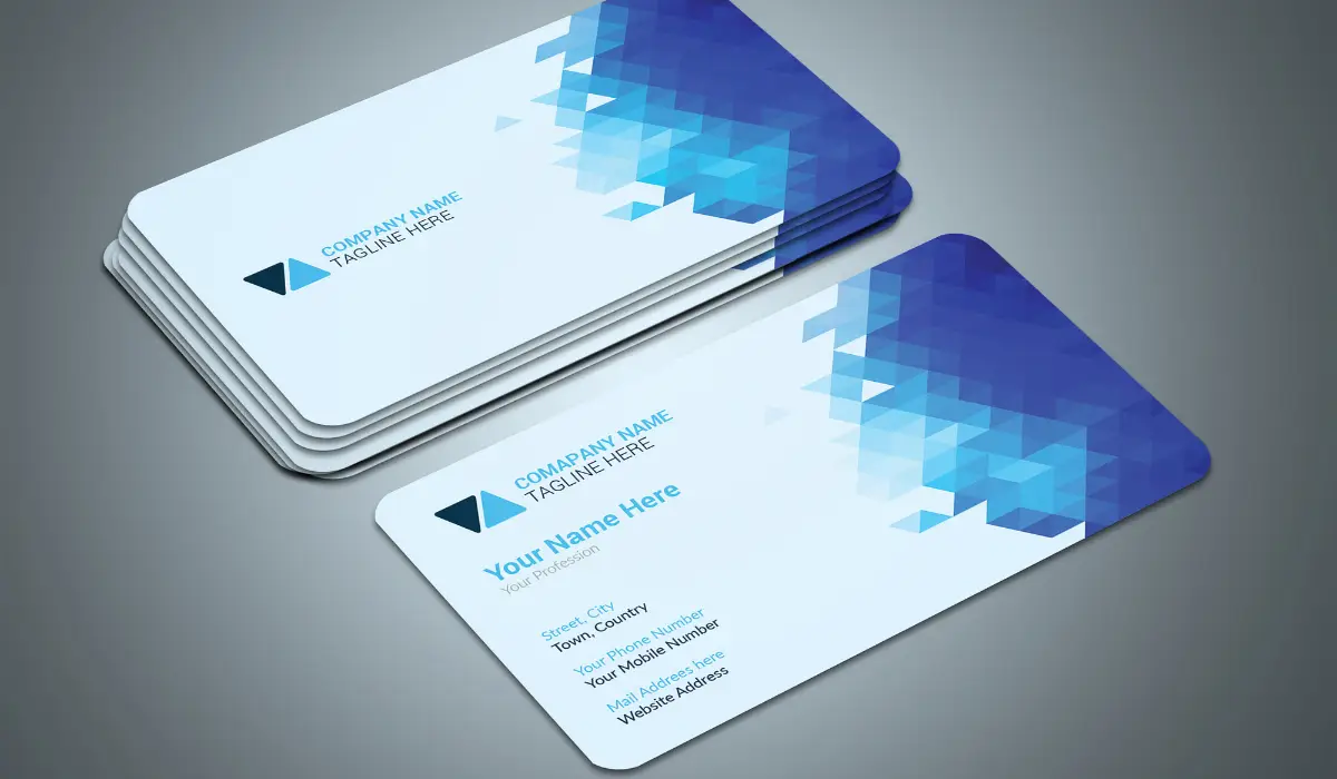
Want to turn your leads into a potential client with one simple and less costly trick? A business card is your answer! You can use a business card to build a lasting impression and mend your brand name into their minds. More than just a piece of paper, a well-designed business card acts as a mini billboard for your brand by providing clients with the necessary information such as your professional information, company address, contact details, and much more. To help you make the most of this small but powerful marketing asset, here are the do’s and don’ts of creating an impactful business card that gets results.
Do’s of Creating a Business Card
Easy to read
Who doesn’t like a fancy font? But when you create a business card, you should avoid using flashy fonts. Stick to simple, clean Serif or Sans Serif fonts for an overall clean look. Keep in mind that color has a significant impact on reading too. Lighter backgrounds with lighter-colored text are extremely difficult to read, and so are the dark backgrounds with dark lettering. Try using contrasting dark and light colors to make the words stand out more.
Correct and accurate information
You will be shocked at how many business cards include incorrect or outdated information. Make sure to proofread your card thoroughly before printing by reading it from right to left. If the information on your business cards changes make sure to print new ones as quickly as feasible. Never cross out text and then rewrite new information on it, as it does not give a nice impression. Your cards should have your company logo, name, professional information, contact details, and website. Plus, you can also add additional information like socials, company address, etc.
Keep the back of your card simple
When printing your business cards, make the most of the extra space without cluttering your card. Therefore while printing on the back is highly recommended you should keep it clean and basic.
You can think of the card’s back as a book cover with a wonderful image that takes you to the other side of the card. For example, we have a customer who sells speedboats. On the back of their card, there is a beautiful photo of someone jumping from the side of a boat.
Similarly, some businesses also place their company logo on the back of the card to free up space on the front. If you have it on the back, there’s no need to duplicate it on the front. Other suggestions include appointment reminders, a list of services, or your company’s tagline.
Focus on your brand
Your brand is your commercial identity because it sets you apart from your competition. It should be consistent across all platforms. Maintaining consistency with your brand colors, visuals, etc. is critical to brand identification and awareness. The theme and color of your business card should reflect your brand.
Use free business card templates
They say that first impressions are lasting ones so don’t waste that opportunity. If you are a creative person use those skills to choose from a range of business card examples and edit it according to your business.
However, if you lack creativity, hiring a graphic designer is an excellent idea. These designers are well-versed in the do’s and don’ts of design. Allow the specialists to handle it, and you will have an attractive business card.
Don’ts of creating a business card
Computer Images
Your computer provides you with a vast collection of free photos and art. However, note that everyone who owns a computer has the same images so you will not be able to create a unique design. Investing in a unique graphic to set your brand apart is always the best way to go. Websites such as iStock and Shutterstock provide a vast collection of stock pictures. Alternatively, you can locate some fantastic sites online that give free photos and templates.
Don’t forget to proofread
Proofread your designs yourself and then also have someone else proofread them. It’s quite simple to overlook an inaccuracy in your contact information. So make sure you get a fresh pair of eyes to look at the artwork before sending it to print. You don’t want to invest in business cards just to have to throw them away because the information is incorrect.
Too much information
Providing too much information can distract a reader and obscure crucial information like your phone number and email address. Remember, white space is beneficial; more is much better. Whitespace not only makes your card appear clean and ordered, but it can also draw the viewer’s attention to the correct information. If you list too many phone numbers, for example, the consumer may be confused about where you want them to call. Only include the number that you want others to use.
Cheap card stock
Never print from your home or workplace computer. You can buy business cards online for about the same amount as printing them yourself and the quality will be far superior.
To Sum Up
If you have a business card that’s not working for you recheck it for inaccurate information like missing contact details or spelling mistakes. Not only does a good design make a difference but the content on your business card is also equally important. Whenever your company updates crucial information make sure to do that on your business card as well.

